Analytics Platform for SaaS Sales
Project Overview
Title: Redefining the Sales Velocity Platform (SVP): Designing a predictive dashboard and workflow tool to drive proactive retention and minimize customer churn for B2B SaaS organizations.
Domain: Enterprise SaaS, Data Visualization, Customer Success, Revenue Operations.
My Role: Concept & UX Strategy, Information Architecture (IA), End-to-End Workflow Design, Executive Stakeholder Alignment.
Timeline: Freelancing, Part-time, 16 Weeks (Concept to High-Fidelity Prototype)
The Challenge
Shifting from Reactive Reporting to Proactive Action
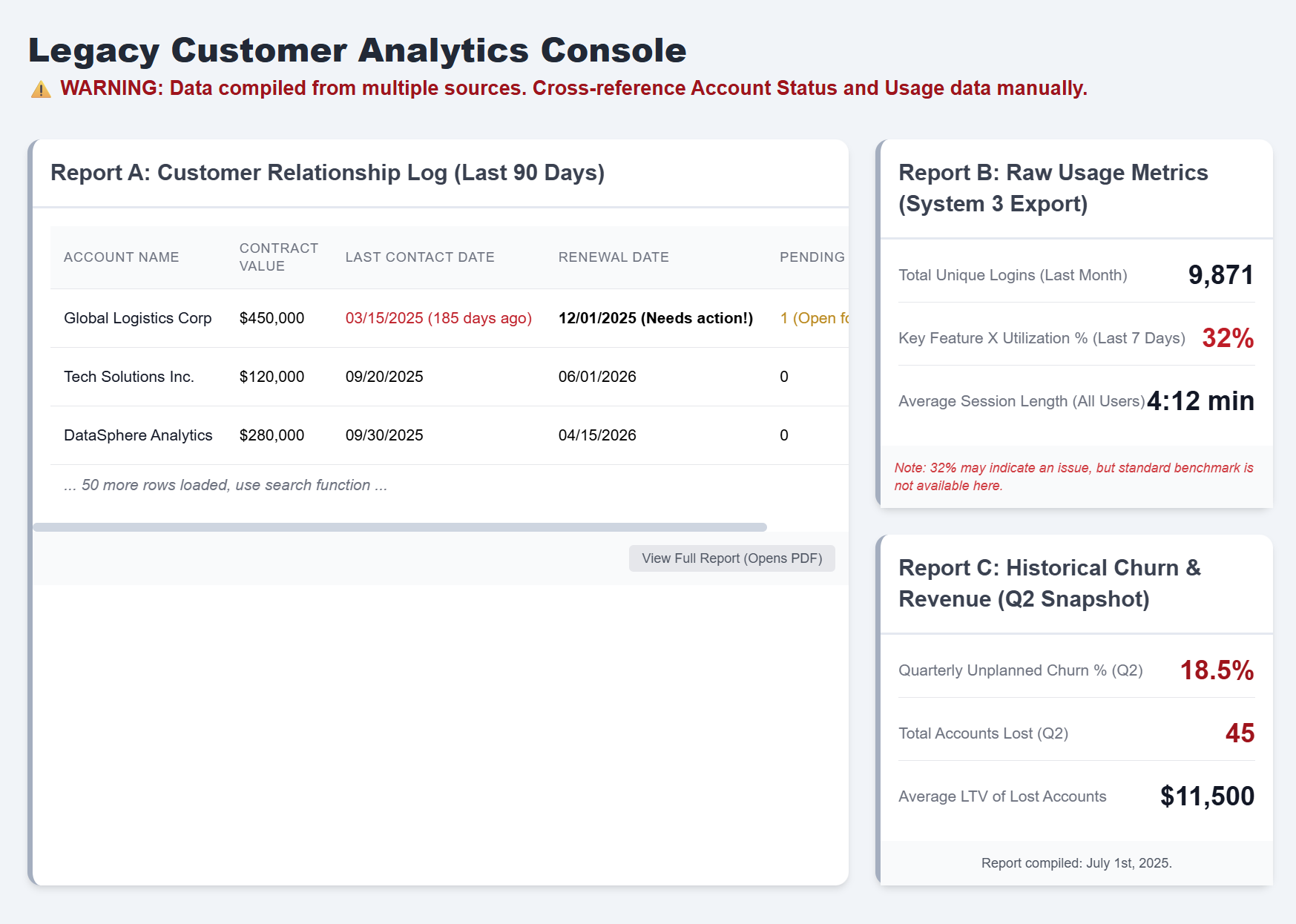
The client—a B2B SaaS provider—suffered from a fundamentally reactive Customer Success (CS) model. Their current analytics solution was a collection of disparate reports that provided historical data but offered no predictive indicators or prescriptive actions.
This resulted in two major pain points:
High Churn Risk: CS Managers only identified at-risk accounts after key usage metrics had already plummeted, leading to an average of 18% unplanned quarterly churn.
Inefficient Workflow: Sales and CS teams wasted 2-3 hours per week manually synthesizing data from 4 separate tools to triage their account lists.
The goal
Transform the platform from a historical reporting tool into a centralized, actionable control panel, measurably reducing time-to-action on critical accounts.
The Approach
Strategy & Systems Thinking
Drawing from best practices in enterprise systems design and data visualization, the project focused on architecting a layered experience tailored to three distinct personas:
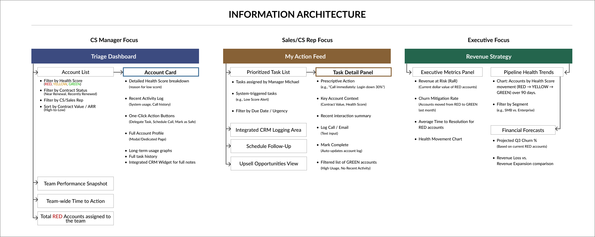
1. Persona-Driven Information Architecture (IA)
We mapped the needs of three key users:
Sales Rep Sara: Needs a prioritized list of high-value Upsell Opportunities.
CS Manager Michael: Needs a high-level view of account health to triage risk for his entire team.
VP of Revenue Vanessa: Needs a holistic, forward-looking view of the entire pipeline and predictive revenue forecasts.

This mapping resulted in a three-tiered IA: Triage (Michael) → Action (Sara) → Strategy (Vanessa).


2. Defining the Predictive Health Score
A critical component was the "Health Score," a single, objective metric. Instead of relying on raw usage numbers, we designed an algorithm combining:
Engagement: Feature utilization frequency.
System Status: Technical error rates/latency.
Contractual Risk: Time until renewal date (to drive proactivity).
This score was visualized using a clear RYG (Red/Yellow/Green) traffic light system, moving complex data into a simple, actionable signal.

3. Modular Component Design
To ensure scalability and consistency across the different views, a modular design system was developed. Key components included:
The customizable Account Card (containing the RYG Health Score, recent activity, and one-click actions) was developed to be reused in external tools and future mobile applications, ensuring a singular source of truth and lowering technical debt.
The Predictive Alert Module (clearly indicating the reason for the risk, e.g., "Login frequency down 30% in last 7 days")
The Solution:
The Sales Velocity Platform (SVP)
The final design provided three core views, all built on the same underlying data structure:
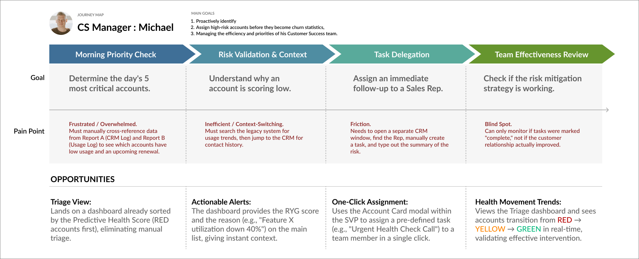
1. The Manager (Michael) Dashboard: Triage Dashboard

This view utilized a Triage View that defaulted to displaying all accounts marked RED (High Risk) or YELLOW (Moderate Risk). Key features:
Prioritized List: Accounts were automatically ranked by Risk Score and Contract Value.
One-Click Assignment: Managers could instantly assign a follow-up task to a specific Sales Rep or CS Agent directly from the account row.
2. The Rep (Sara) Dashboard: My Action Feed
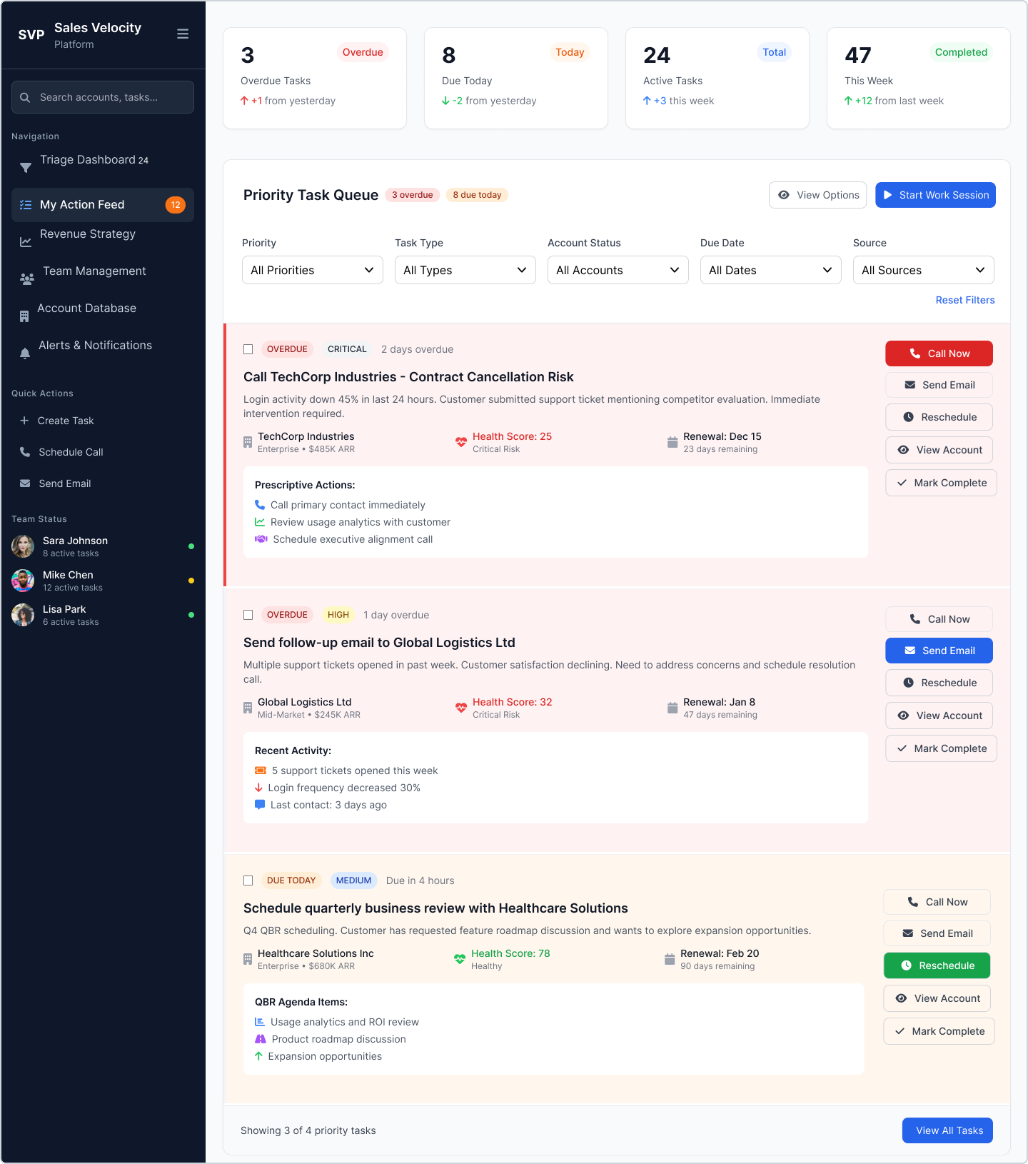
This view focused on minimizing friction and enabling immediate action.
Actionable Alerts: Rather than just showing a chart, the system provided prescriptive actions (e.g., "Call Account X: Renewal in 30 days, Login inactive for 5 days").
Integrated Workflow: The dashboard allow logging calls, scheduling meetings, and updating the account status without navigating away from the dashboard.
3. The VP (Vanessa) Dashboard: Revenue Strategy

This view stripped away operational details to focus on executive summary metrics.
Revenue at Risk: A single-number forecast showing the total monetary value of accounts currently marked RED.
Pipeline Health Trends: Simple trend charts visualizing the movement of accounts between the RED/YELLOW/GREEN categories over the past 90 days, enabling strategic resource allocation.
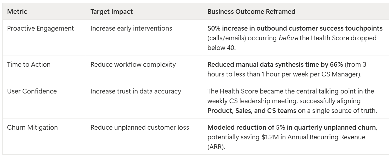
Results & Demonstrated Impact
The new platform design achieved a significant shift in business behavior and operational efficiency, showing clear executive-level results: