Skull and Bones

Position: Lead UX/UI Design
My responsibilities:
- Meta game Menu UX Guideline
- UX & UI weekly review
- Drive Social Feature Design
Date: 2019 - 2020
Company: UBISOFT
Genre(s): Open-world, action-adventure
Platform(s): Sony Playstation; Microsoft Xbox; PC
Introduction:
Skull & Bones is an action-adventure video game developed by Ubisoft Singapore and published by Ubisoft.
The game is released on 16. Feb. 2024. The game revolves around piracy and naval warfare.
Background
After 7 years of development, Skull & Bones underwent a major gameplay pivot in 2018. This shift required a complete rethinking of the game’s meta-game menu experience, ensuring clarity, consistency, and scalability across multiple studios.
I was appointed to create a Meta-Game Menu UX Guideline—a cross-studio framework that defined our UX vision and set a standard for consistency across a co-development team of 5+ studios and 30+ UX/UI designers.
This guideline covered:
UX Vision & Principles
Information Architecture & Menu Frameworks
Layout Regulations & Grid Systems
Control Schemes & Interactions
Camera & Animation Usage in Interfaces
Typography & Localization Standards
The Challenge
Can we make it simpler?
With a large development team and many years of feature expansion, the system had become bloated and complex. Every game designer wanted their feature visible in the main menu—resulting in proposals for 20+ feature buttons competing for space.
This risked overwhelming players with information overload and making navigation unintuitive.
The Goal
The guiding principle:
“I know why I am here; I know where I am; I know what to expect.”
Every tab in the main game menu needed to:
Be directly tied to the core gameplay loop.
Clearly communicate what type of information or action it offered.
Provide a progressive disclosure of detail, guiding players step by step.
The Approach
1. Information Architecture
We began by mapping all features, collaborating with game designers to sort, categorize, and prioritize them using a card sorting method:
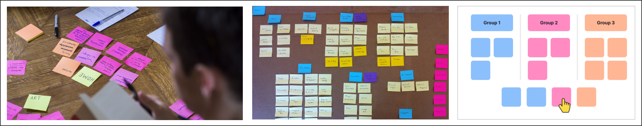


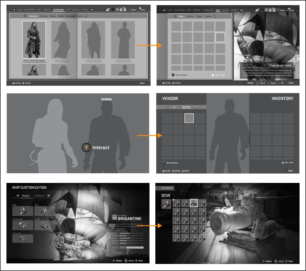
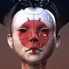
From 20+ features, we refined the structure into 8 main tabs, each answering a high-level player question:
Clan - What is my Clan Progression?
Blueprints - What Can I build/find?
Map - Where should I go?
Journal - What could I do?
Knowledge - What do I know?
Ship - What is the status of my Cargo/Crafting station?
Captain - How awesome am I?
Infamy - How can I get season items?
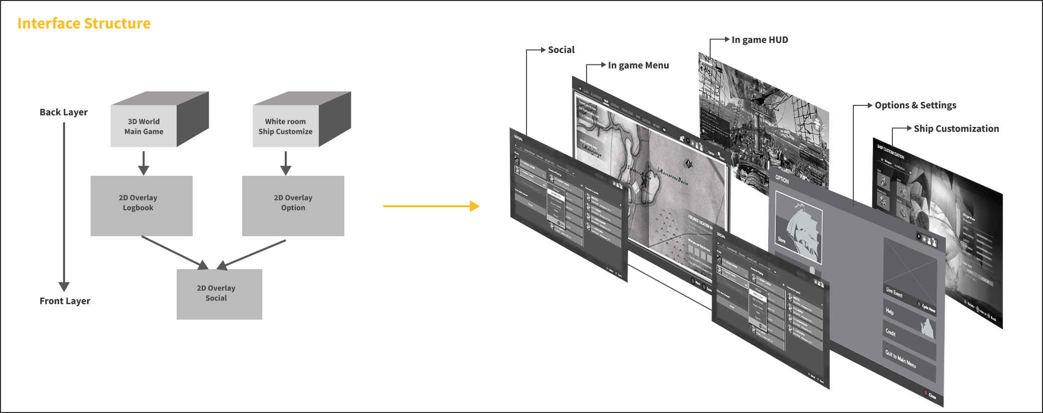
In addition, we defined three menu layers:
LOGBOOK – Diegetic, world-oriented
OPTION – Non-diegetic, support-oriented
SOCIAL – Overlay, communication-oriented
2. First-Time User Experience (FTUE)
We prioritized accessibility options at the start, ensuring players had essential setup tools available without overwhelming them.
Key balance:
For players who need accessibility settings → give robust options upfront.
For players who don’t → allow them to get into the game quickly without unnecessary friction.

3. Layout & Interaction Structure
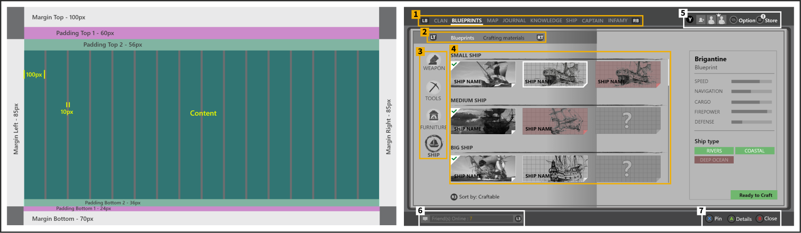
All interface layouts followed a grid system for visual consistency. Interaction rules were standardized across all menus.
Navigation Hierarchy
Top Tab – First-level navigation (Logbook screens change when switching).
Sub Tab – Secondary navigation.
Category – Groups of related features under sub-tabs.
Sub-Category – Narrower divisions within categories.
Corner Components – Always present in 3 fixed corners of the pause menu.
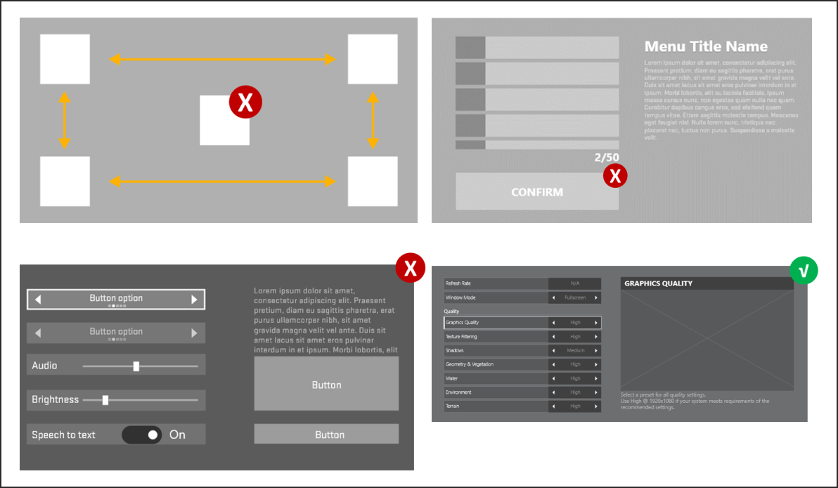
4. Layout Composition Principles

Details on Demand
Present essential info upfront.
Allow deeper exploration for customization and advanced details.
Reduce overload by progressively revealing complexity.

Intuitive Navigation
Define clear hierarchy of information.
Organize screens into primary, secondary, tertiary tiers.
Use visual grouping and hierarchy to reduce reading time.
5. Interaction Principles
Menus across Skull & Bones shared a consistent navigation and interaction system, crucial for cross-platform usability.
D-Pad / XY Focus Navigation
Movement restricted to up, down, left, right.
Each object supports contextual actions (Equip, Craft, Access).
Clear visual distinction between interactive vs non-interactive objects.
Strong focus and selection indicators.
Special Case – Map Menu
Uses a free cursor centered on player position.
Designed to avoid inaccessible UI elements caused by XY focus limitations.
Avoided placing essential elements behind long scrolling lists/grids.

6. Camera & Animation in UI
The camera was used to blend 2D menus with the 3D game world.
Guidelines:
Shift 2D UI to the side when presenting 3D objects.
Keep the camera position consistent when zooming between menus.
Prevent UI from obscuring 3D objects (use transparency where needed).
Ensure camera motion is smooth and frame-coherent to avoid disorientation.
Some Wireframes


The remainder of this guide is hereby omitted from this article.
Outcome
By defining a comprehensive UX guideline, we:
Reduced 20+ competing features into a streamlined 8-tab structure.
Established cross-studio alignment on menu design and interaction rules.
Ensured clarity, consistency, and scalability across all platforms.
Created a player experience that is intuitive, guided, and immersive.
Below are some menu examples from the release version 2024
Thanks for reading!